Ontario Map Shows First Dose Rates In Every Region & Which Spots Are In The Lead
Some regions have higher vaccination rates than others.
Ontario Map Shows First Dose Rates In Every Region & Which Spots ...
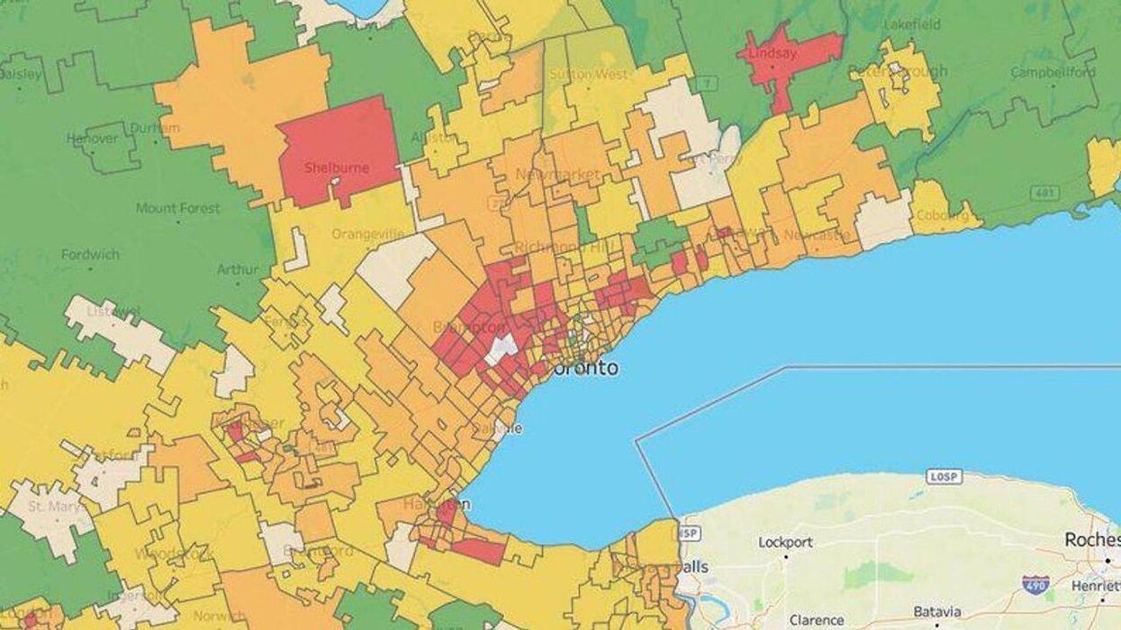
As the province continues to battle with COVID-19, a new Ontario vaccination rates map shows just how many people are getting their first dose in every region.
The map, which was put together by Bill Comeau, a former mathematical statistician, shows residents exactly which Ontario regions are nailing it, as well as which regions are falling behind, in terms of vaccination rates.
According to CP24, Comeau has been collecting data through various federal, provincial, municipal and third-party organizations and using it to create the interactive map.
As of May 24, 2021, the region with the highest rate of first dose vaccinations is Sarnia, N7W, with 68.4%.
The other top six spots are located within Toronto with second place going to areas within the city's M8X postal code at 67.7%. M4G, M5M, M1C, M4T and M4N follow closely behind.