People Can't Get Over How 'Depressing' & 'Unsettling' This TTC Station Mural Is (PHOTOS)
Do you love it or hate it?
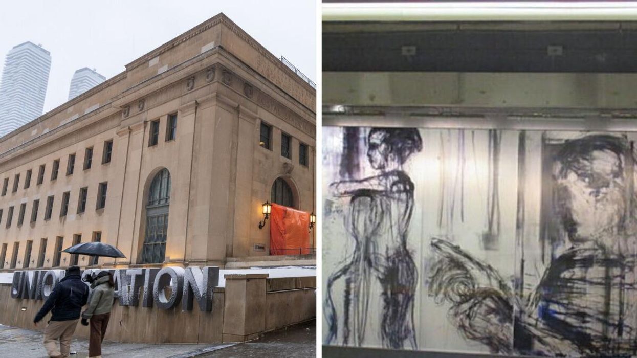
Union Station in the winter. Right: A section of Zones Of Immersion.
If you've boarded the TTC subway at Union Station over the last few years, you've likely entered into at least one staring contest with the dreary grey faces that hang across its platforms.
What you're looking at is Stuart Reid's "Zones Of Immersion," a sprawling mural that has sparked several debates since being erected in 2015 due to its bleak and downtrodden appearance.
A Toronto Reddit thread appeared to reignite that old conversation on Sunday after a user called out the display for being "depressing" and "unsettling" and questioned if the city would ever change it.
The post quickly spurned hundreds of reactions, with many commenting on their own interpretations of the mural and whether they enjoyed or disliked it. And needless to say, there were some hot takes.
"Like an artist's rendition of what depression looks like," reads one of the thread's top-rated comments.
And things only got deeper from there:
"It makes me think of concentration camp art," added another in a jarring description of the piece.
Few disagreed on the art's inherent gloominess. However, some defended it, arguing that the mural accurately captures how commuting can feel, especially for those who do it daily.
"If you told me it was a memorial to people who threw themselves onto the tracks, I'd honestly believe you. And that'd be powerful, in its own way. But, yeah, knowing it's just his view of what people are like on the subway," one user wrote.
"Yes exactly. This is a visual representation of a creeping loss of personality, and essential humanity. Somehow, I like it. But not sure it's appropriate for the setting," said another.
As for the artist's take on the piece, he previously said, "this work presents the unvarnished witnessing of our human dwelling – which speaks of our collective separateness."
According to Reid's website, the artwork is over 500 feet long and can only be experienced by those who walk the entire terminal length.
"The work is visible only in the intervals between the arrival and departure of trains," he added. "At rush hours, this is less than every 5 minutes."
Love it or hate it, Reid has undoubtedly created a piece that has forced people to ponder and converse. And that's far from nothing.
This article's left-hand cover image was used for illustrative purposes only.
- The TTC Is Hiring For So Many Positions & These 7 Jobs Pay Over $100K A Year ›
- Someone Added LCBO Locations To A TTC Map At Union Station In Toronto & It's Lowkey Helpful ›
- This TTC Map Shows The Only Stations That Have A Public Bathroom And It Proves Our Transit Is Absolutely Pathetic ›
- People Are Sharing How Confusing Toronto's Union Station Is & It 'Literally Makes No Sense' - Narcity ›