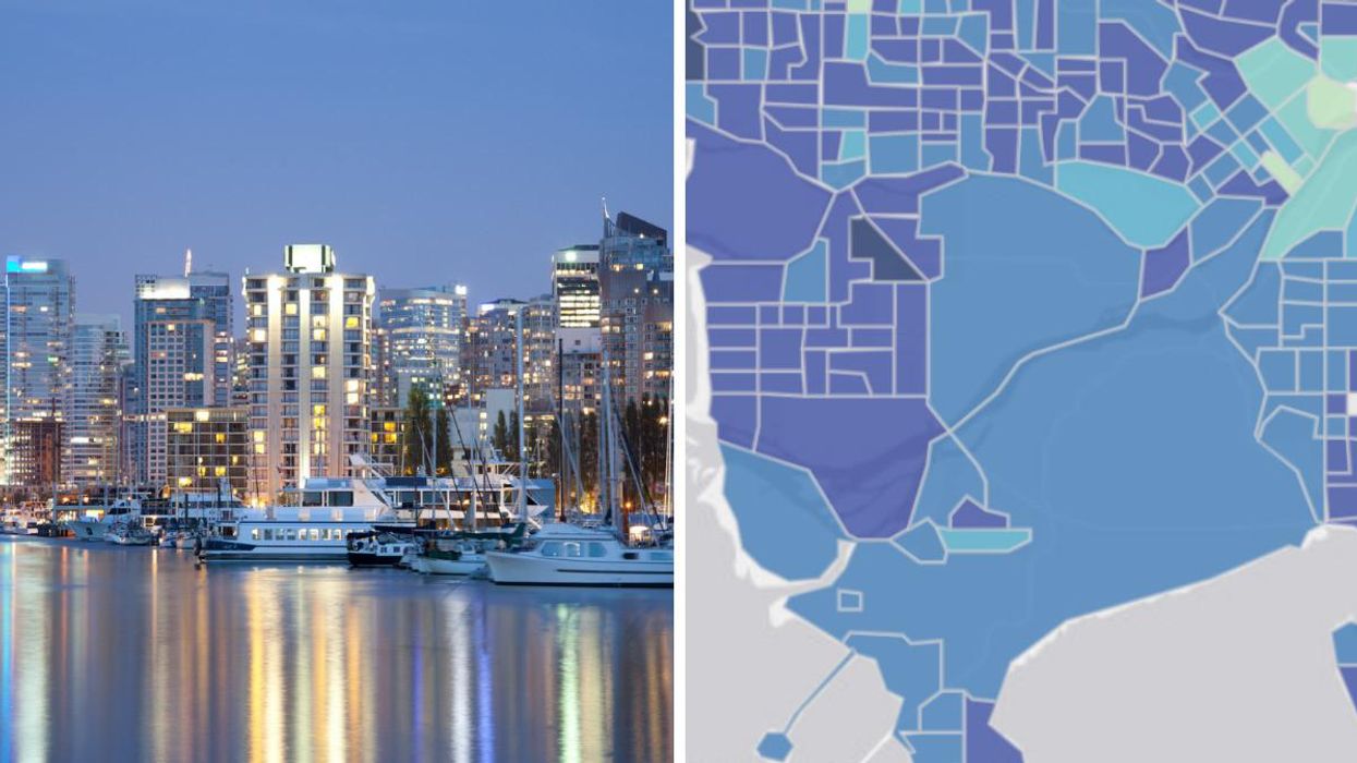
An interactive map of Metro Vancouver shows that how long people live can vary by almost a decade based on the neighbourhood.
The map was created by the University of British Columbia, which led a study on life expectancy.
Despite Vancouver being one of the healthiest cities in the world, it apparently all depends on the neighbourhood you live in when it comes to your life expectancy.
UBC said that this points to inequality in Vancouver, in that people living in the areas with high poverty live shorter lives.
The data revealed that in some cases, people that live as little as five kilometres away from each other can have an almost 10-year difference in how long they're expected to live.
UBC noted that Downtown Eastside and Haney in Maple Ridge were areas that had a lower life expectancy. For men and women in those areas, the expectancy was about 75 years old.
On the flip side of the data was West Vancouver, West Point Grey, northwest Richmond and certain areas of South Surrey and Coquitlam, which all had high life expectancy.
You can use the interactive map to compare the year, to see how life expectancy has changed from 1991 to 2016.
 The University Of British Columbia
You can hover over the area to see the specific life expectancy age.
 The University Of British Columbia
UBC said that overall "inequality in life expectancy between its neighbourhoods has grown considerably since 2001."
- BC's Living Wage Is Revealed & This Is How Much You Need To Be ... ›
- The 5 Cheapest Cities To Live In BC & How Much You Need To ... ›
- People Are Debating What The Worst Town In BC Is & It Just Got ... ›
- Here's What's Open & Closed For Remembrance Day in Vancouver - Narcity ›
- People Were Debating What The Worst Town In BC Is & It Got Super Heated - Narcity ›